As Seen In: A Favorite Project Featured in Architectural Digest


{from the archives, this article originally appeared on ArchitecturalDigest.com and in the July 2013 issue of the magazine}
At one of the early meetings with the owner of a gracious new English Arts and Crafts–style residence in Atlanta’s Buckhead neighborhood, interior designer Suzanne Kasler sifted through a sheaf of inspirational tear sheets and sketches—a dream file—compiled by the client. Kasler says she quickly recognized the woman’s taste for “a kind of decorative minimalism” expressed by muscular furniture, sturdy textiles, and richly aged reclaimed wood—elements, she notes, associated with what’s often called the Belgian look.
“We’re a very casual, laid-back family, and Suzanne got that right away,” says the client, who, with her husband, an entrepreneur, had commissioned architectural designer William T. Baker to create the six-bedroom house to share with their three children, now ages 12, 19, and 21. “Our home is always full of kids—our own as well as their friends—not to mention animals. So one thing I said was, ‘No fragile and expensive antique carpets and no furniture that’s too good for us to sit on.’ We have two 200-pound, waist-high English mastiffs and a Chihuahua. Of course, the Chihuahua rules.”
To accommodate this frolicsome menagerie, Kasler devised interiors that offer a spirited take on traditional design, infused with a dose of modern practicality. Brawny oak paneling, crystal chandeliers, vintage Swedish campaign chairs, linen-slipcovered upholstery, and hardy sisals are all part of the mix. And did we mention the indoor basketball court with a black-lacquer floor?
“This house is all about juxtaposition,” Kasler says. “Town and country, formal and informal, elegant and rustic, dressed up and dressed down.”
That description applies to the architecture as well as the decor. Located on a sloping corner lot, the 17,000-square-foot structure features exterior walls of handsome Tennessee fieldstone, topped by a pitched roof of chocolate-brown cedar shake. The design pays tribute to the late-19th-century work of architect Edwin Lutyens, deploying a sweeping stone arch at the entrance, strong projecting gables with flush rakes, tapering chimneys, steel casement windows recessed into the masonry walls, and large transoms above French doors.
“It’s in a vernacular that speaks to our time because of the effect it achieves through form and asymmetrical massing rather than through elaborate details,” Baker says. “Younger homeowners are drawn to it because it conveys charm, not grandeur.” Kasler, who has collaborated with Baker on numerous residences, adds, “In an age when machines can produce thousands of pieces of furniture—even buildings—in a very short time, my clients still request homes that are personally, individually crafted.”
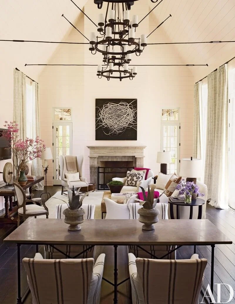
Throughout the house, dramatic variations in ceiling height help to delineate the spaces and make each feel distinctively tailored, as in the transition from the intimate entrance gallery, with its low ceiling, into the luminous double-height great room. Adding to the artisanal vibe is Baker and Kasler’s generous use of the weathered, salvaged timber the client adores. Magnificent old posts and beams were enlisted not only for the entry but also for several rugged door casings and the peaked canopy over a section of the expansive pool terrace. Even where new oak was preferred for a more refined finish, a warm rusticity prevails. The dining room’s plainspoken paneling, for instance, looks as if it might have come from a western cattle ranch. And the rolling barn-style doors that divide the guest room from its bath suggest nothing so much as a hayloft—albeit a superdeluxe one.
As she often does, Kasler jump-started her room schemes with a single fabric. In this case it was a magnified “sophisticated-but-not-too-sophisticated suzani pattern,” as the designer puts it, that she fashioned into simple curtains for the great room. Kasler then isolated colors in the print and strategically rephrased them: blue-gray–striped upholstery for the campaign chairs in the same room, orange wallpaper with a stylized leaf pattern in a powder room, a luscious lavender silk rug in the master bedroom.
“When I design I’m always thinking about how a home sequences, how people experience it as they move through, how continuity is voiced and to what degree,” says Kasler, whose latest book, Timeless Style (Rizzoli), will be published in October. “The use of color here is highly selective, creating a subtle, neutral envelope that permits the interior architecture to sing.”
The true heart of the home, the owner says, is a sprawling all-in-one space in which the open kitchen, featuring stout cabinetry below a shiplap ceiling, melds with the family room, where a trio of robust pendant lights descends amid a network of ornamental iron trusses. Demonstrating her belief that contrasting objects make intriguing bedfellows, Kasler didn’t hesitate to insert a playfully proportioned linen wing chair, a sober bluestone-and-iron dining table, and a vintage antler mount into the room’s lively array.
Thanks to multiple French doors that lead to the pool terrace, the family moves seamlessly between indoors and outdoors much of the year. That blurring of boundaries is also ideal for entertaining, notes the client, who has been known to host parties of 200 or more. “We just open all the doors,” she says. “It’s a spectacular space that flows effortlessly.”


